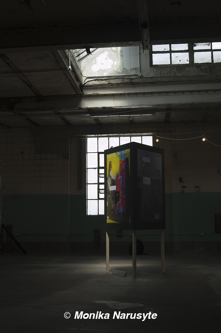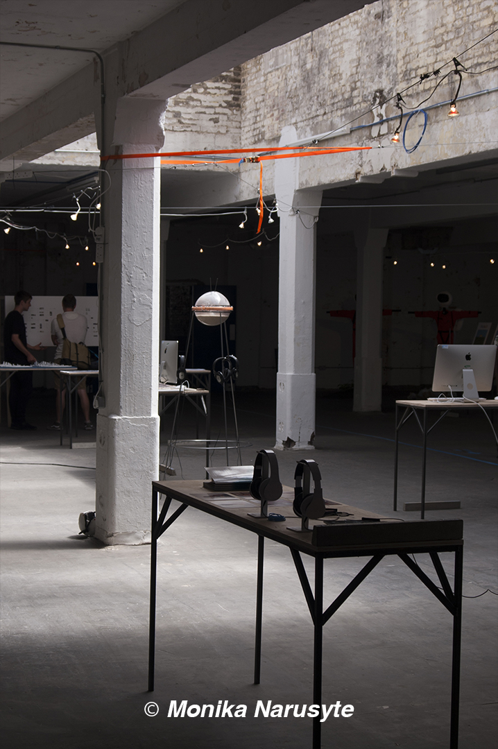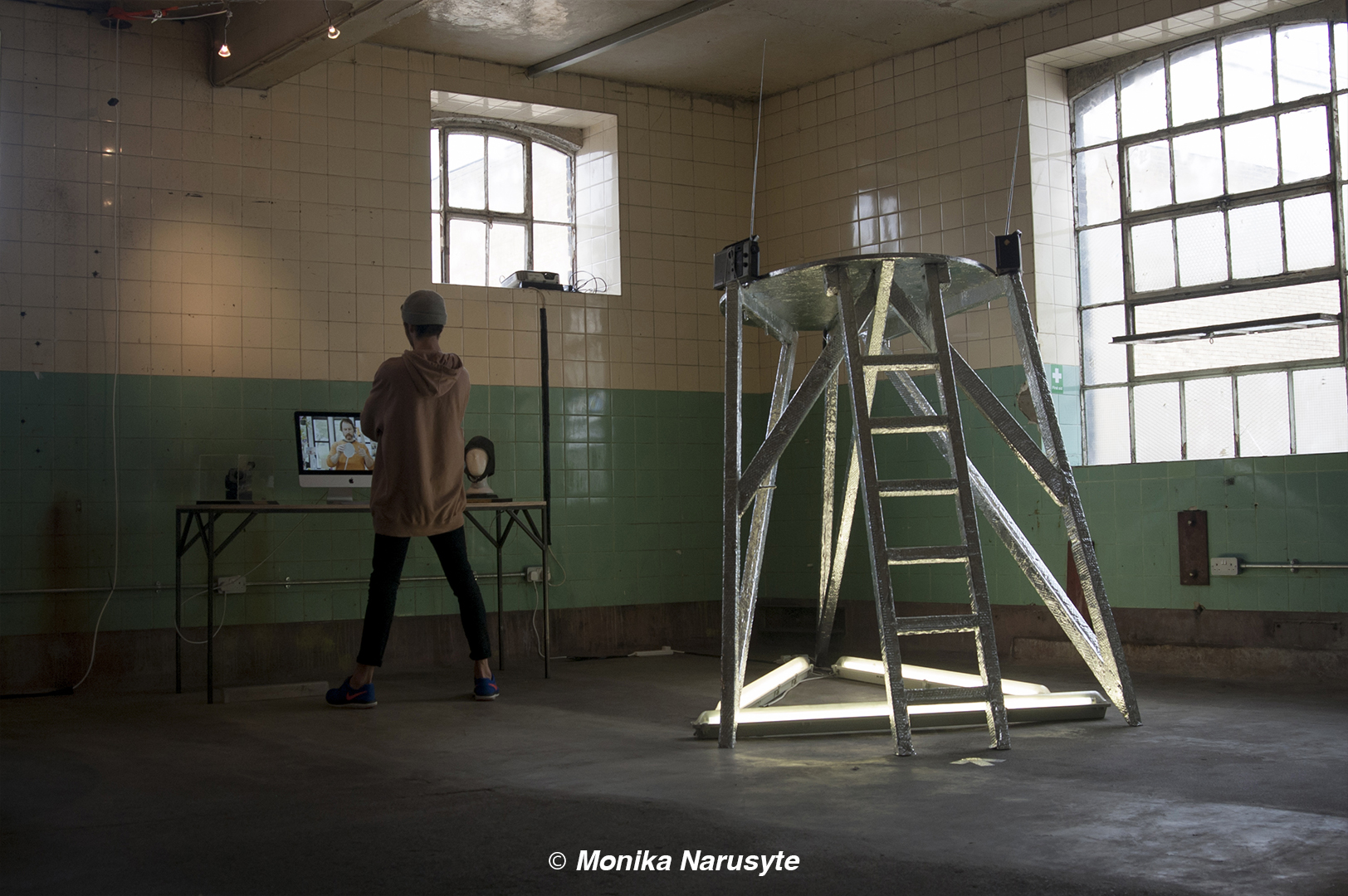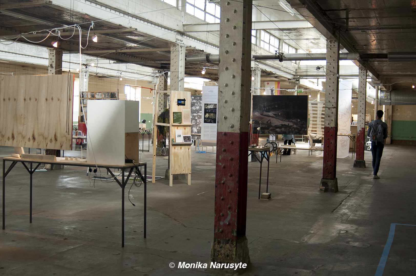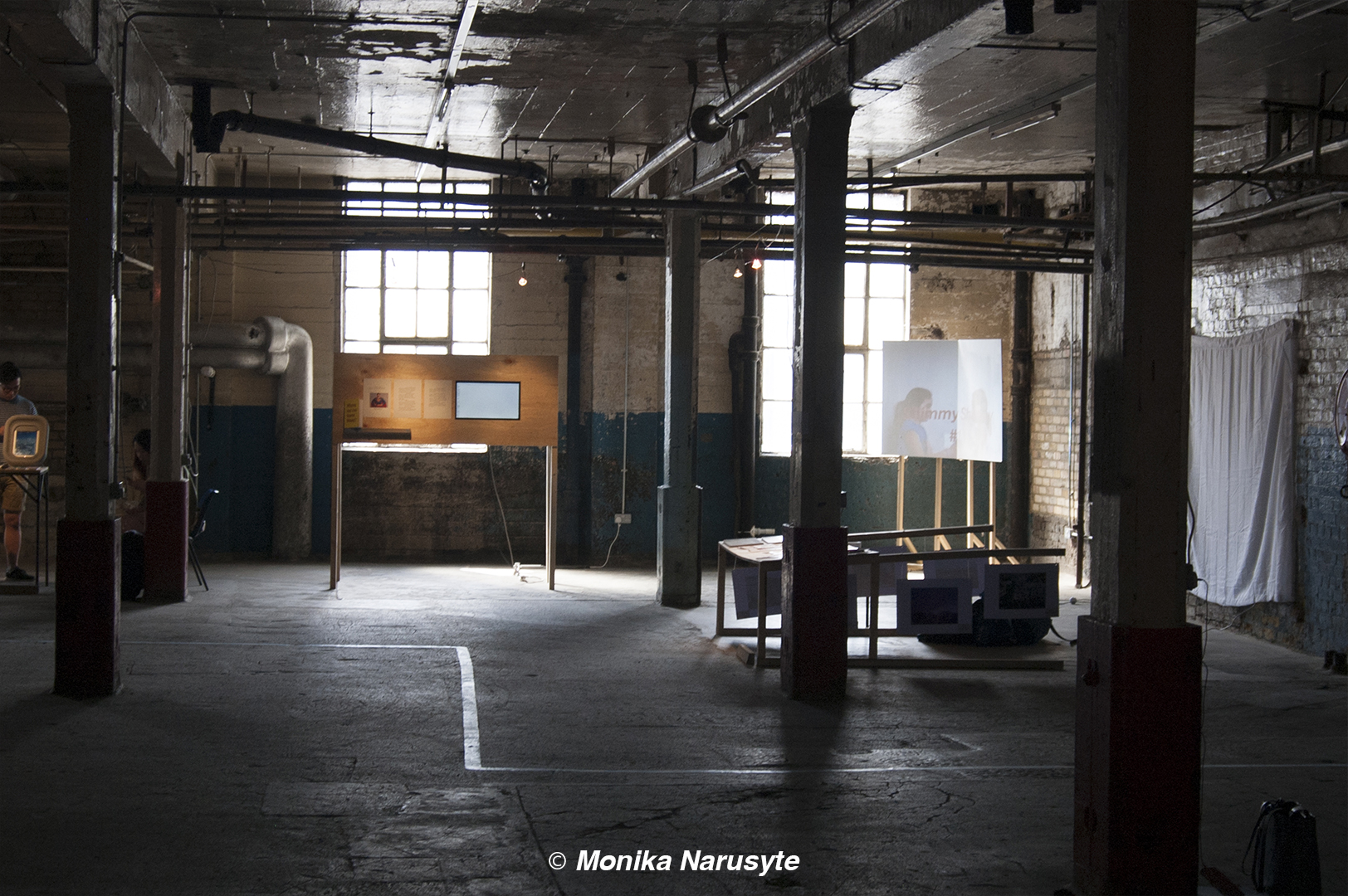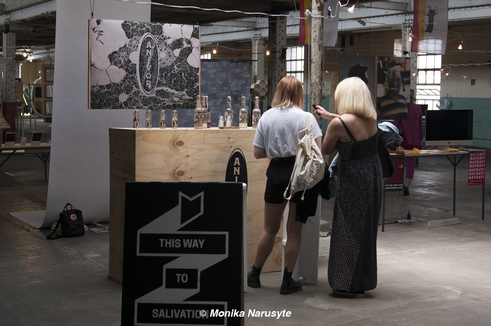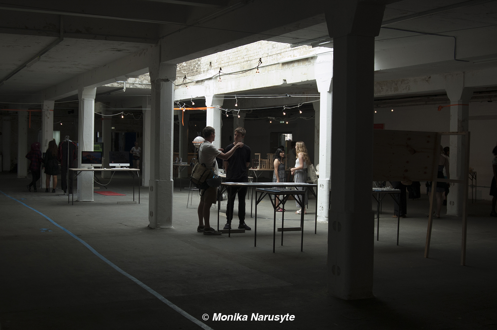
Hyphen Show
Whilst in the final year of Goldsmiths BA Design course in 2017, myself and Hugo Volrath took the helm of design for our end of year show catalogue and I built the accompanying website.
The show titled Hyphen is best summarised by this quote from our year leader Juiet Sprake;
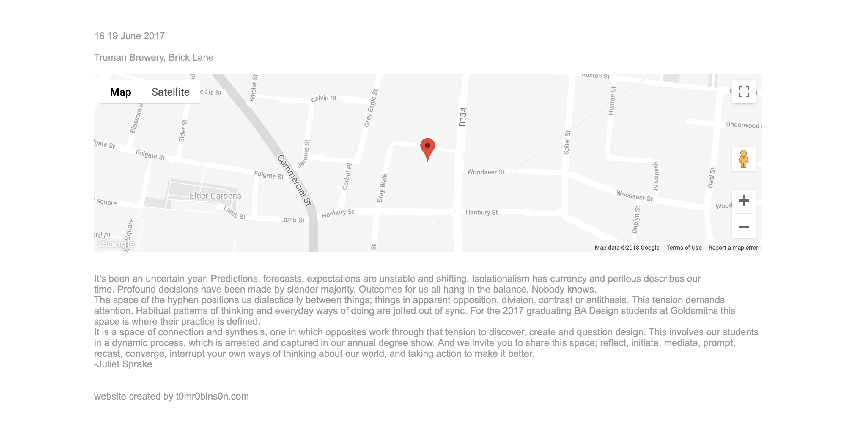
‘It’s been an uncertain year. Predictions, forecasts, expectations are unstable and shifting. Isolationalism has currency and perilous describes our time. Profound decisions have been made by slender majority. Outcomes for us all hang in the balance. Nobody knows.
The space of the hyphen positions us dialectically between things; things in apparent opposition, division, contrast or antithesis. This tension demands attention. Habitual patterns of thinking and everyday ways of doing are jolted out of sync. For the 2017 graduating BA Design students at Goldsmiths this space is where their practice is defined.
It is a space of connection and synthesis, one in which opposites work through that tension to discover, create and question design. This involves our students in a dynamic process, which is arrested and captured in our annual degree show. And we invite you to share this space; reflect, initiate, mediate, prompt, recast, converge, interrupt your own ways of thinking about our world, and taking action to make it better.’
The political and design landscapes have become ever more divided and decisive and as a collective our course pursued the ideal of merging, conjoining, amalgamating, HYPHENating these fractured pieces through our work.
Conveying this message through print and web design proved to be a challenge, one we took the opportunity to push ourselves to thrive within. Firstly how does a course year as a collective separate themselves from the rest of an industry and ecosystem without just, well, being weird?
The first hurdle we met was the colour pallet, and as a year group we settled upon CMYK. The four raw colours used to create print media. They hold no emotion and the possibility for creation is endless. Most importantly they have no ties to existing movements, ideals, practices or isms, just pure colour in its rawest printable form. The pure Cyan, Magenta and Yellow when placed touching one another create a space so filled with contrast that any content is almost undefinable and although this was a desirable aesthetic in many ways we needed to be able to convey our message through it in a much clearer fashion. After much tweaking with the individual colours we settled with an almost pure Yellow, a Blue close to royal and a Red with a rich burnt tone. Although this no longer immediately represented CMYK in the same manner it still upheld the same visual values due to the colours close relationship to the primary colours.
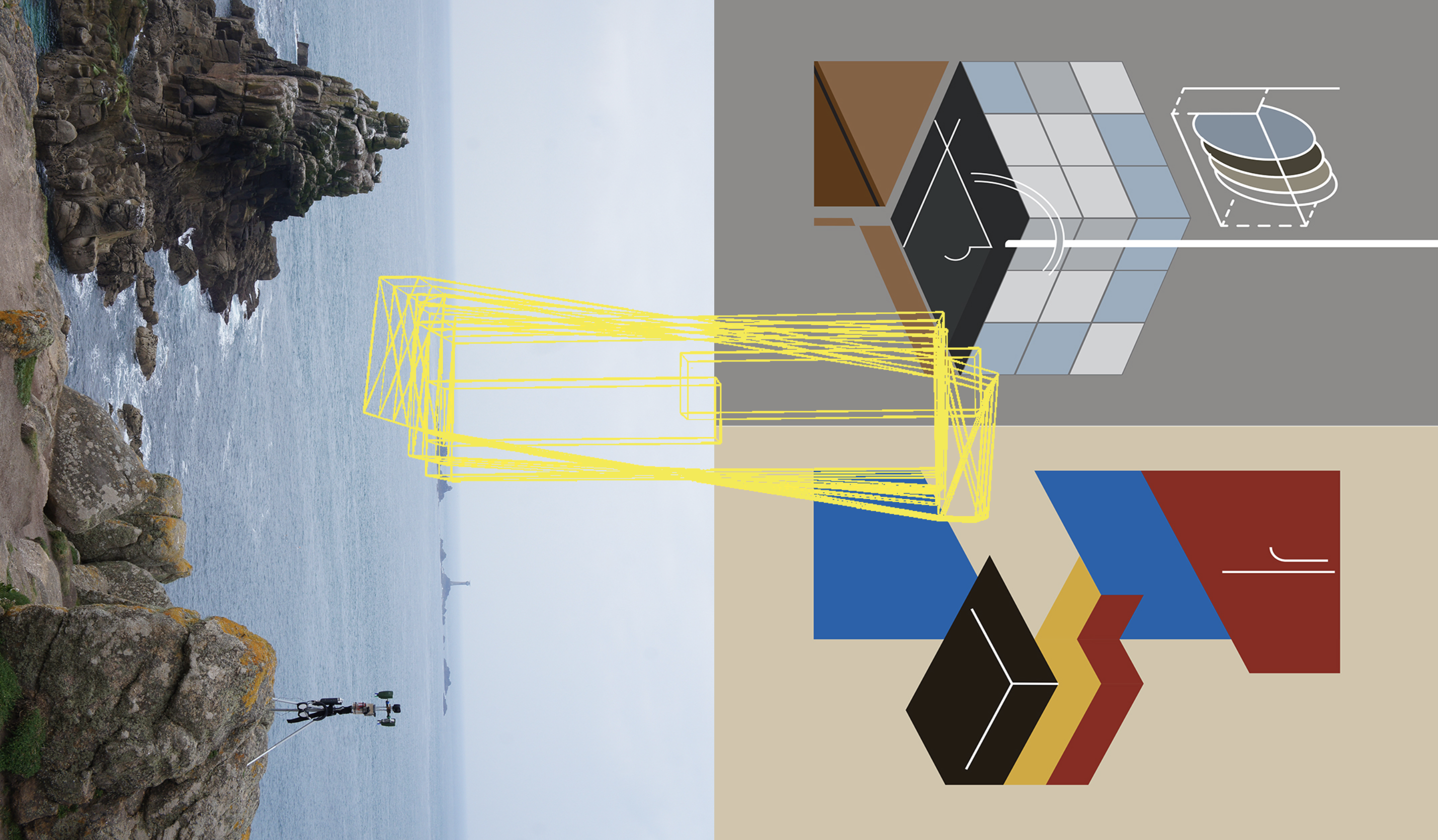
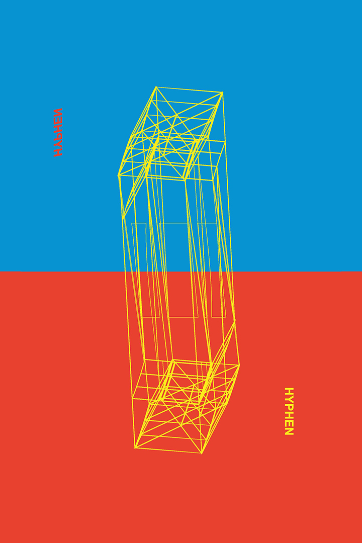
From this pallet other members developed a logo; wireframe three dimensional hyphens layered together as one to create a larger whole. This still artwork was later developed further into a motion animation used on the website.
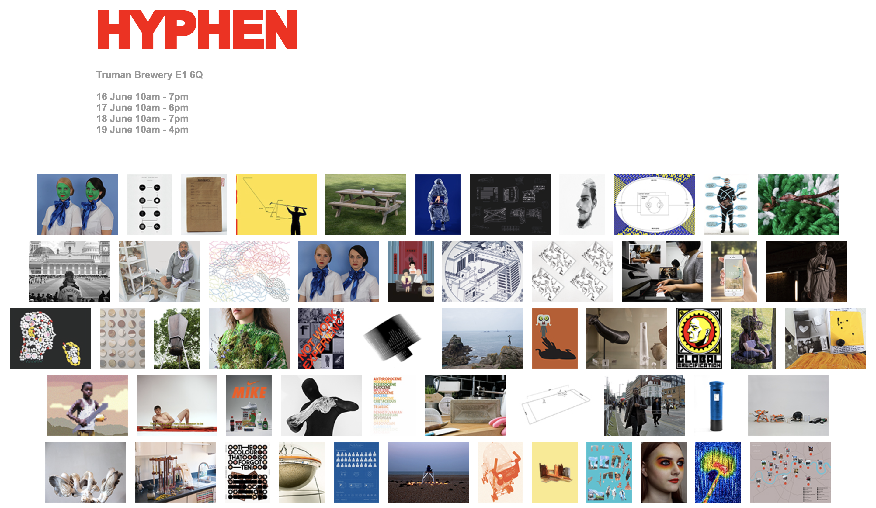
Our greatest layout challenge was to create a system through which to display every student's work through the lens of hyphenation. After much deliberation we decided to display individual projects together in unison as a visual hyphenation.
On web this involved creating a site which greeted the user with a full screen hyphen, based on an in hindsight elaborate image selection script. Every time the site loaded a different two random images of student projects would load alongside one another, filling the screen. The complexity within this however was allowing every image to load on either side of the screen but never at the same time as itself on the opposing side for over 100 different photos. Over laid and centralised on top of these images can be seen the 3D animated hyphen logo visually connecting the two words and drawing the user into the identity of the show.
With over 100 students on the course we had to keep every piece of information on each project as concise, precise and to the point as possible with every student allowed only a single image to depict their work and a 500 word description.
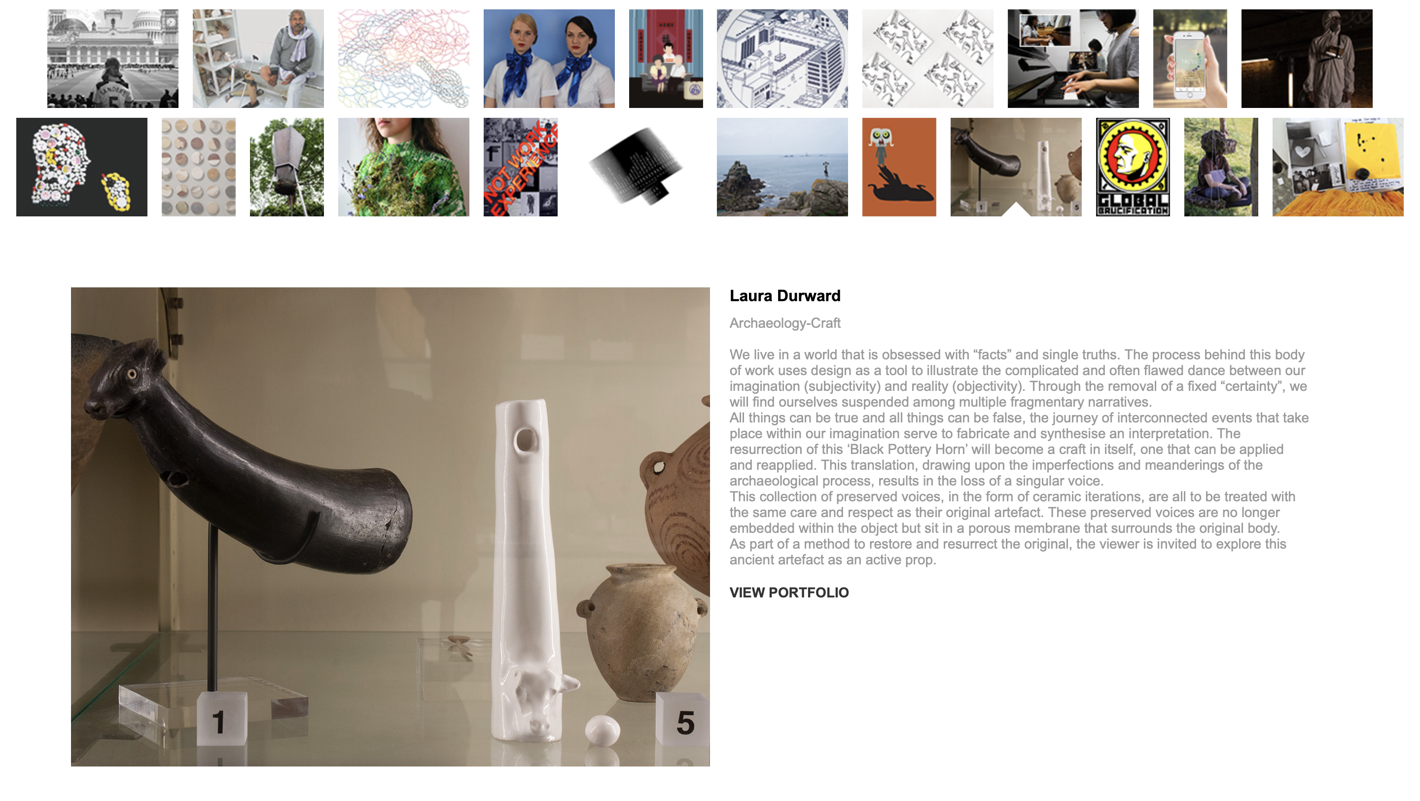
In web development it quickly became apparent that allowing each student project an individual page would not be a suitable format as viewers would lose interest rapidly and creating a menu system for over 100 unique yet repetitive pages was a minefield best left uncrossed. Instead I choose to use a format anyone with access to the internet would be accustomed to: Google Image Search. The layout of this google web service is incredibly intuitive, condensing a high volume of information into a single web page. Each image clickable, revealing below it a larger version of itself and any information regarding the image. It’s a universal style and therefore matched perfectly with my need to ensure every project was given equal exposure on the page; allowing the user to select the images which they found of most interest to discover more.
Monika's full gallery from the Hyphen Show can be found HERE
